Graphic Design Services
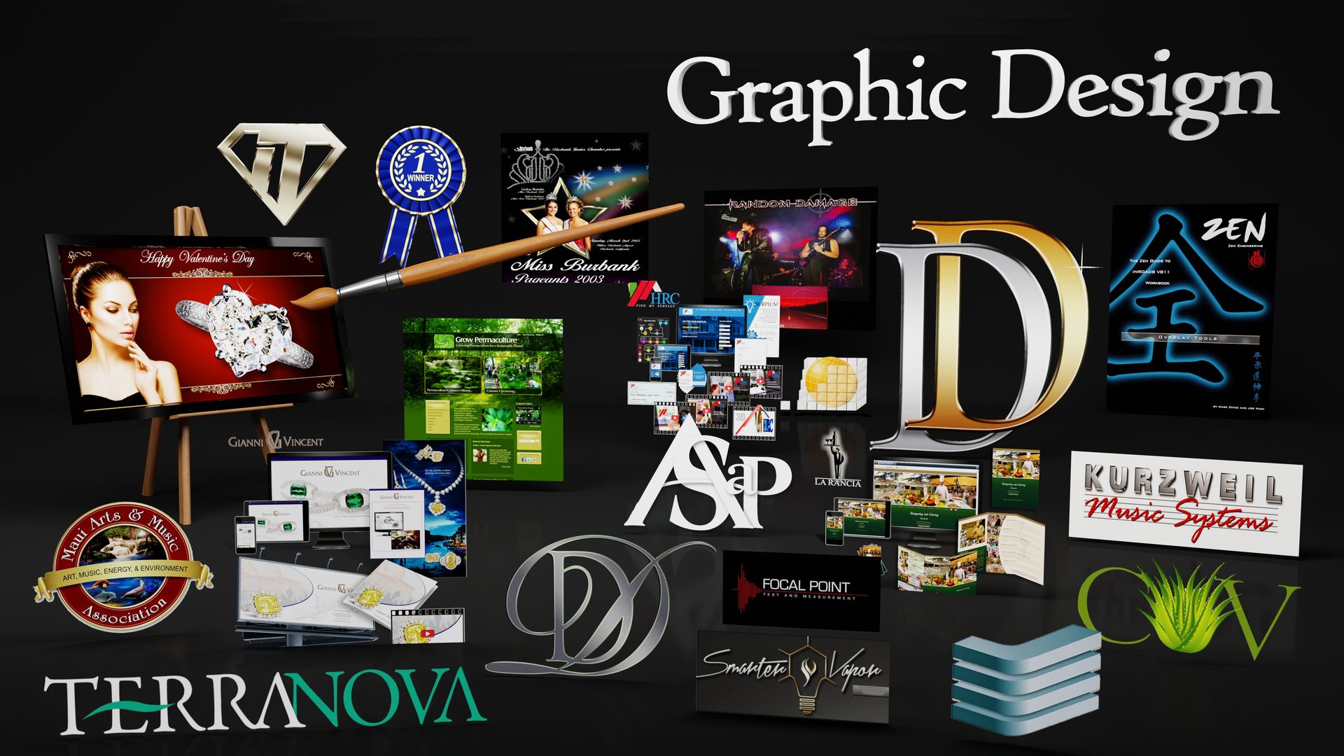
Graphic Design
What's your graphics needs? We offer graphic design of many formats and applications. Just name it! We offer a wide range of branding and graphic design service, from logo designs, visual identity packages, re-branding strategies, business cards, info sheets, brochures, catalogs, marketing materials, presentation materials, trade show booth design and banners, multimedia presentations, product packaging, and more. We specialize in Integrated Campaign Design, Style Guides and consistency throughout your entire marketing presence. With our graphic design, you can be sure of enhanced branding appeal, professional and competitive visual presence, and improved sales in products, services and revenue.
You know... Good graphic design.
What goes Into Good Graphic Design?
So what DOES go into graphic design? Is it just making things look pretty?
When we research and approach a new project, we're asking the important questions:
What audience is the message for? What culture are they? What values and ideals to they hold? What idea, concept or message should be conveyed? What emotion should be conveyed? What imagery should be used? What photos should be used? What subject matter should be used? People? Faces? Objects? Places? What straight lines, curves, angles or criss-crossing lines/objects should be used? What shapes should be used? What patterns should be used? What sizes should be used? What hierarchy should be used? Why do colors have certain meanings associated with them (red=stop, anger or passion; green=go or growth or renewal; blue=trust or stability or purity, etc.) and how should I use them? What color palettes should be used? Primary colors? Secondary colors? Warm colors? Cool colors? Aggressive colors? Receding colors? Monochrome? Analogous? Acromatic? What hues? What tints? What shades? What tones should be used? What color gradients? What opacity? What saturation or intensity should be used? What textures should be used? Bright light? Soft light? Subdued light? Evening light? Candlelight? Colored light? Should things be moved left, right, up or down? Should things be close up, or distant? Should things be in sharp focus or blurred? What opacity should be used? Should some things touch other things, or partially cover other things? What POSITIONING should be used (positioning; something along side something else to create a visual association, or juxtaposition; the fact of two things being seen or placed close together with contrasting effect)? What symmetry and Balance should be used? How to display the flow of things? How much, if any, repetition should be used? The Golden Ratio? The Rule of Thirds? What Fonts and Typography should be used? Etc., etc.
And how to use ALL this to make things VISUALLY usable, impactful, meaningful and pleasurable?
Branding and Graphic Design
When you look at Tesla, Apple, Trader Joe's, IMB, UPS, Shell Oil, Subway, BestBuy, Target, Taco Bell, and many other established brands, what do you see?
Here at Endless, we understand the importance of unique and easily recognizable visual identity, and its impact on the various aspects of the business. A great brand visual representation is not only the face of the company, it's probably THE key elements of the business success.
Ultimately, it represents the experience that the customer/consumer is expecting to have with them.
And that goes for their entire promotional marketing campaign.
Does it have to be sophisticated? No, but there's certainly sophistication that goes on behind the scenes that ensures branding solutions will make your business look marvelous. Every project for us is an opportunity to put our skills to the test and come up with fresh, unique, innovative and captivating designs and marketing solutions that will perfectly and pleasingly represent your business, ideas and values.
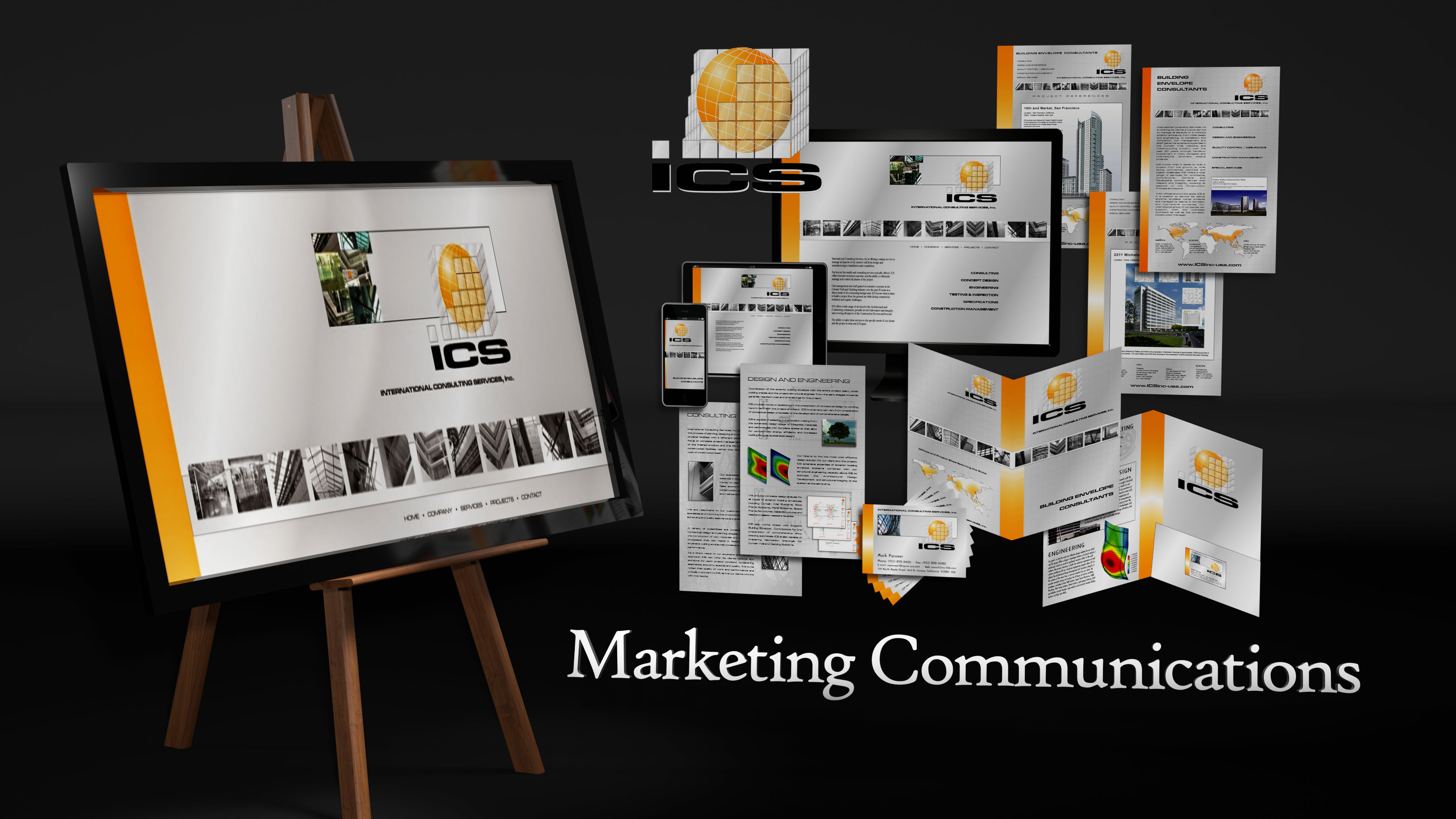
Marketing Communications
General Graphic Design and Layout
We offer general graphic design and layout for printed or online marketing including Ads (all shapes and sizes), Business Cards (part of campaign), Info Sheets, Brochures, Postcards, Banners, Handouts, printed Presentations, etc.
What is Marketing Communications?
Although the definition refers to the various channels and methods companies to convey their message about products and services to persuade them to purchase, for graphic design in this sense we mean the PROMOTIONAL MATERIALS used for each of these various marketing methods. In other words, the promo pieces themselves that are used to promote with. Anything that requires some graphic layout design to produce the artwork, printed or online.
Different Promo Material for Different Marketing Channels
Now there's different types of marketing strategies available, and each may require different promo materials. For example:
-
Traditional Marketing
Any type of promo material that isn’t online. This means printed flyers and info sheets, business cards, postcards, posters, booklets, catalogs, direct mail, billboards, newspaper ads, magazine ads, handouts, door hangers, stand-up banners, etc., etc. - Internet and Digital Marketing
Beyond a well designed website, and email campaigns, Social Networks are a great place to post videos and ads, and once shared with the community, those promo pieces are seen by many. - Paid Ads
May require design and layout artwork for printed ads, or perhaps design and layout for online ads and banners, Pay per click, and other paid advertising. - Word-of-mouth Marketing
May require design of flyers, or business cards, or coupons, or referral incentive handouts, or other people-to-people promo pieces. - Retail Product Infomercials
These days it's rare to find a supermarket or retail store without some info product video looping on a screen right there beside the product. Yes, we can certainly do these too. - Direct Sales
May require info sheets, flip charts, printed or online presentations, and of course business cards and handout materials. - Trade Shows and Events
May require very large size banners, booth design, several types of info sheets, handouts and business cards.
The examples continue, but just let us know what your campaign strategies are, and what promotional pieces are needed.
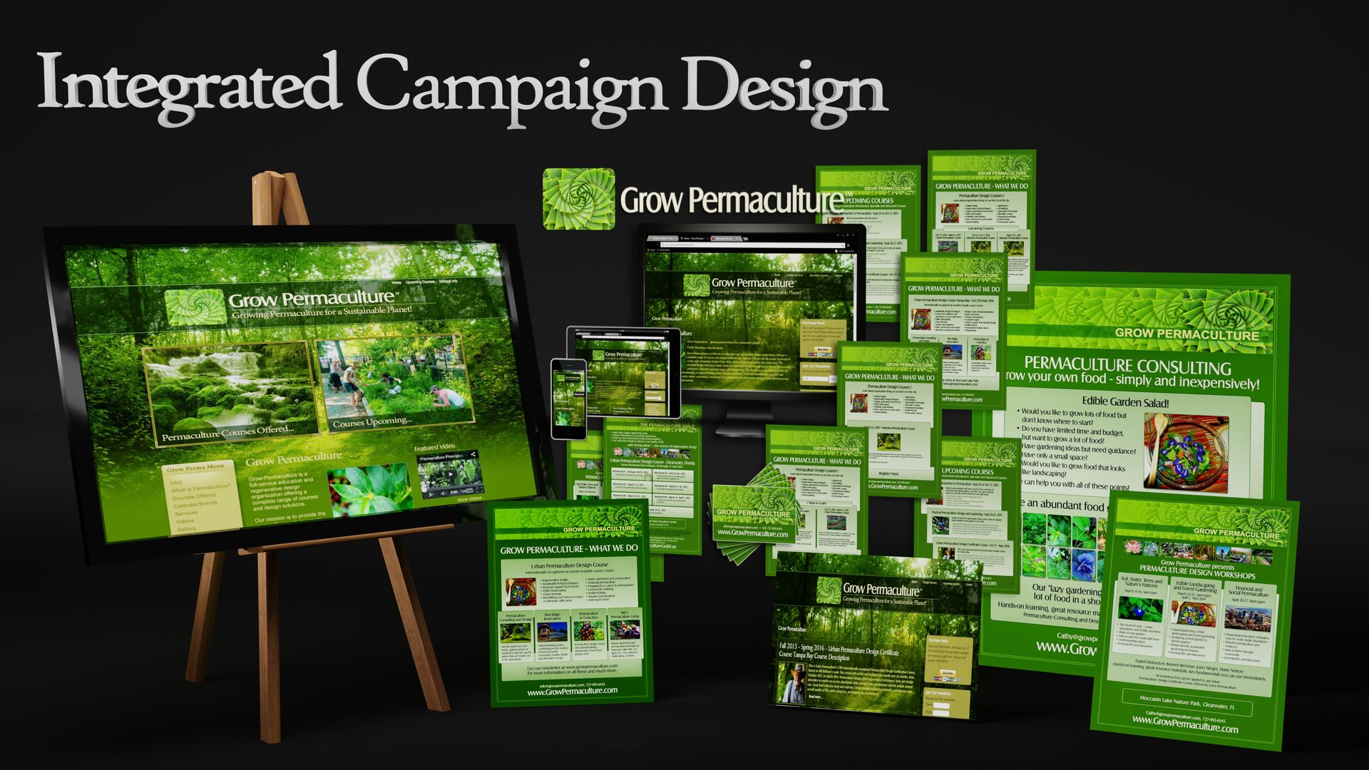
Integrated Campaign Design
Integrated; meaning combining or coordinating separate elements so as to provide a harmonious, interrelated whole.
It's all about consistency in image and graphic design across the entire marketing campaign.
Integration.In graphics, that means consistency in design.
In marketing, that means utilizing and combining multiple channels such as website, video, ads, email, and social media in order to promote with a consistent message to a specific audience.
Why is Integrated Campaign Design important?
Imagine discovering a new brand on your favorite social channel, visiting the company’s website to purchase one of their products, only to find their website looks completely different, it's promoting a different message, a different product or a different service. Huh??? You’d have a hard time understanding that brand, or having any confidence whatsoever to buy from them, right? Might as well buy from some nomad street vendor passing by.
Integrated campaign design in marketing promotion exists to eliminate these disparities and differences, regardless of how or when a customer interacts with your brand.
Coca-cola, McDonalds, UPS, Heinz foods, FedEx, Virgin Airlines, Wells Fargo, Samsung, LG, the list goes on and on. And each serves as a great example to brand consistency and integrated campaign design.
Integrated campaign design is effective because it has consistency, thus predictability of consumer experience, thus confidence. It serves to present a united marketing “front.” A consistent image. A recognizable and reliable product or service. At least that's the idea.
This increases the potential to reach a wider audience. This means you have a greater chance of being seen and RECOGNIZED on multiple marketing channels, thus keeping your brand top-of-mind and pushing visitors closer to conversion. This builds trust with visitors as they see a consistent message on multiple channels. This also saves you money in promotion because marketing assets can be used with repetition and repurposed for different marketing channels. This also serves in organic expansion such as social networks and word-of-mouth referrals because customers will more likely help you market your product or service for you.
So... Is your campaign designed with recognizable consistency? Let's keep it together.
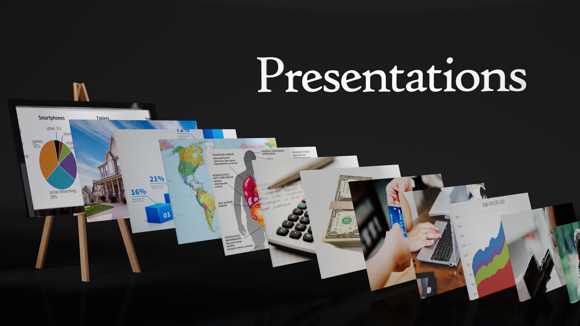
Presentations
VISUALLY show your presentation
"Show Don't Tell!"
—Film and Graphics Industry
Why does the age old screenwriting mantra endure? Because a picture really can tell a thousand words.
We offer presentations of all sizes and formats. Slideshows, graphics, charts, diagrams, flow charts, Webinar and Zoom call slides, etc.
What is a Graphic Presentation?
Graphic presentation uses numerous forms of expression ranging from the written word to the most abstract of drawings or statistical graphs. The purpose is better understanding by visual Content. A Presentation provides an important medium of expression which helps clarify literally, verbally, or statistically any presented information.
People need to see it! And this brings improved understanding, improved retention, and improved response.
What goes into a Presentation?
Your imagination is the only thing that limits a presentation. We've created the full spectrum of presentations with exclusively words on a white background, and exclusively picturesque presentation containing NO words at all. Either way (and any variation in between) is better than standing in front of people trying to convey your intended message with nothing other than your verbal description.
Further, Presentations with truly nice graphics leaves the audience with a lasting impression and your more memorable message.
We can create presentations for any platform such as Zoom, Google Slides, etc, and presentation graphic elements that can be used just anywhere. You'll discover the transitions between Frames (slides) are far less important than the slides themselves. So who cares? We quite often forego the software, simply create beauteous slides and utilize a photo slide show (photo manager) program to flip thru this organized collection of slides to achieve the same (actually far better) resulting Presentation.
Words are important. Keywords and Key phrases should be prominent on the screen, and held up long enough to explain the concept, give examples, and ensure its audience understanding.
Graphic Elements are important. Emphasize concepts, separate ideas from other ideas. Show importances, show relationships. Visually COMMUNICATE your message with anything that depicts the intended idea.
Diagrams and Charts and Flows are important. Use a diagram to show the appearance, structure, or workings of something. It becomes a schematic representation. Ever try to describe a living room layout to the wife without a diagram? Diagrams show drawings or plans that outline and explains the parts, operation, etc., of something. The scheme.
Use a chart to provide statistical (quantitative) data and to present the relationships between variables. Use a vertical or horizontal or circular chart. A table of data, to contrast data, to suggest relationships of data (ie. Pie Charts, etc.), or perhaps to symbolize a concise summary for comparison, etc. Anything to visually explain data. Simple or complex, use types, colors, arrangements, and detail to further aid the presentation.
My team and I use charts a lot. We can mull over a give chart for hours.
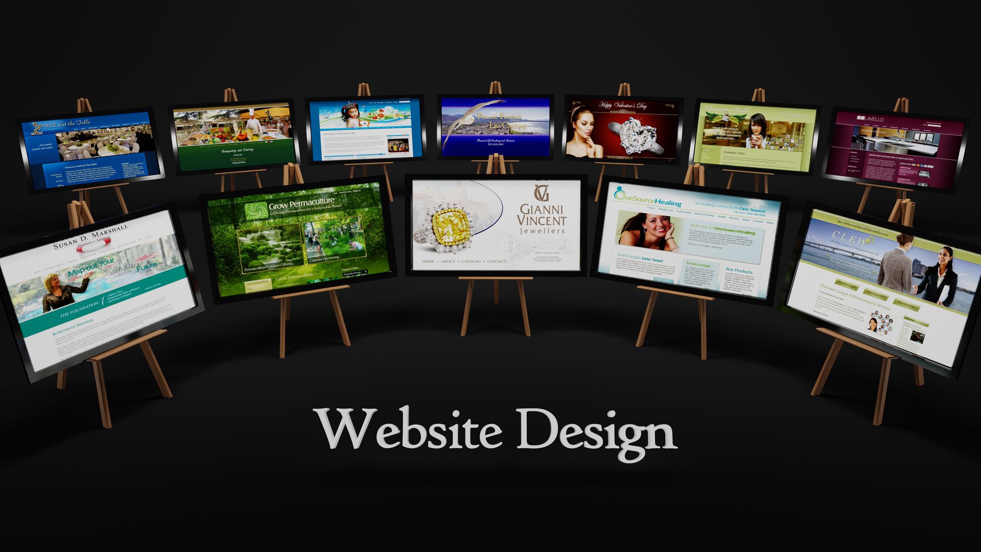
Website Design & Development
Professional Websites
We offer websites starting from
$599
(Not including hosting and any Content materials costs. We use Joomla opensource platform, contributed to by over 10,000 web coding geniuses.)
Just ANY website will do, won't it?
Not really.
Buyers will visit your website on average of 7 times before they decide to buy from you.
Still think just any website will do?
What goes into a better quality Website?
Art / Technical / Marketing
Website design and development encompasses many different skills and disciplines in the production and maintenance of websites. It's a delicate marriage between art, graphic design aesthetics and technical and marketing.
- A better website must have better CONTENT to appeal to the visitors and the Search Engines.
- A better website must have all the correct TECHNICAL nuts and bolts to satisfy today's SEO and security, etc., AND function withe the visitor interactivity today's browsing audience has come to expect of any better website.
- AND a better website must LOOK great to set itself in a high position among the completely saturated ocean of great looking website designs available these days, AND be easy to navigate and find in the desired information. Usable.
Website design is not just words and pretty photos pasted on a page. It's Website DEVELOPMENT where graphic design meets interface design meets code authoring meets user experience design meets Search Engine Optimization.
What Content? What Pages?
Content for any promotional piece is a huge topic, including a website. The most simple question such as "What pages should be on my website?" and "How to best organize website Content into logical sections?" could be the make or break of the website, and the key to visitor/buyer conversion ratios. And it's no longer a pretty Homepage with Keyword-rich verbiage that's important in that regard. The entire website should have RELEVANT Content, and be careful NOT to spam the Search Engines with too many repetitive Keywords. That's not just "old school," that's dangerously obsolete. Search Engines are pretty sophisticated A.I. these days, and you could emphasize the "intelligence" in that concept.
Search Engines and visitors alike are looking for relevant Content that answers the questions people ask in their Searches and Internet queries. What are visitors looking for? What are they EXPECTING to find on your website? What do the Search Engines require of your website? Why would a Search Engine post YOUR website above others? These questions are essential, let alone its look and beautification. What design works for its target market? What age group? What culture? What audience trends? Is it designed for end consumers or business-to-business? Is it for retail or entertainment? Further, Websites should EDUCATE as much as attempt to sell. An online brochure is great, but an online INFORMATION source trumps every time.
Graphic Design Aesthetics and User Experience
Better website design ensures the aesthetics don't clash with the clarity and accuracy of the Content, intended marketing message or the ease of navigation. USABILITY. What is the final USER EXPERIENCE? Did the user find it usable? Was it intuitive and user-friendly? Was it useful? Thus it's really interactive user interface design.
Imagine YOU visiting your own website... How did it go? Did you find what you needed to get answered? Did you find it thru the Search Engines or referral? Did it look professional and aesthetically pleasing?
Reputation is everything, and better design and better content makes sure clients are portrayed favorably.
Better websites should have better Content hierarchy, better Typography and better Page layout. A big part of user interface design is the quality of the page layout. How the Content is presented, the look, and layout. Sure, keep it simple, but it's important.
And those page layouts are also important for different browsers, different screen resolutions and different device sizes. Which brings us to...
Responsive Page Design
Today's Website design means making sure it's Responsive, that it looks correct on any device it's viewed from (ie. Desktop, laptop, tablet, smartphone, portrait or landscape orientation.) Ever visit a website on a mobile phone that looks wierd? There's a good reason for that, and the better web designer will keep Responsive design in mind as develops the project.
Which Programming to Use? Joomla Rocks! WordPress Sucks!
We use exclusively Joomla opensource platform, because it's great, robust, bulletproof, and contributed to by over 10,000 web coding geniuses. And it's updated constantly for security exploits and improved features.
You wouldn't want a website built on WordPress, despite its popularity because of "ease of use," where it requires over 30 plugins to run at all, would you? And when those 30 plugins fall out of date? Yeah, the website fails to work, or becomes a huge security hazard. Ugly. Do YOU the client know how to dive in deep and get things updated and running properly? Doubtful you would have either the know-how or the patience to install, update or debug a set of 30 plugins just to keep your website running. (So tell us again why WordPress is popular?)
Client can (and should) ADD/EDIT/DELETE his own Content
Another great reason to utilize a Content Manager System (CMS) like Joomla, is that once the website is constructed, the CLIENT can make his own additions, edits, and deletions to his Content. Login and have at it. So unless it's a major design change, etc., the client doesn't have to go running to the designer and pay for routine updates to Content that the client can (and should) do himself.
A Blog for example is easy for the client to jump in whenever he wants and keep his website fresh with new Content, which of course improves his SEO in the process. New Testimonials. New Products. New Services. New personnel. Whatever. Add, change or delete. You can even set the date for future Publishing. It's all there.
Hidden Pages and Permission Levels
Joomla also allows for several User Access Levels. Which means the client can hide certain pages from visitors, so they can't see those pages. This is useful for subscriber Content, Intranet and internal functions, collaborations, etc., etc.
Graphic Elements for Web
VISUALLY convey your idea / message
Beyond the plain text, there's visual aids.
Photos, montages, vignettes, banners, graphic elements, icons, buttons, diagrams, charts, graphs, etc., etc.
Graphics and graphic elements can be used in limitless ways to far better convey your message. Sure it can be idiotically simple, but text is not enough. The text and verbiage writes it out, but people want to SEE it.
You know, the kid that looks ONLY at the pictures of the magazine and reads nothing? Sorry, but that's everybody these days. And years ago, that's how comics books became so popular. Today's MCU hero movies are based on SEEING even more.
A given webpage or entire website just lacks any inviting appeal if visitors have to READ the words and imagine the visuals exclusively in the confines of their cranium. (Books are great, but I'm afraid the vast other forms of visual media are fast making the plain text medium obsolete in marketing.)
No, they want to SEE the pretty girl or the handsome guy pop off the page, and that shiny product just leap out at them and say "buy me, buy me!" They want taste that frosty soft drink with their eyes, and experience the vastness of space without having to imagine travel.
While these graphic elements are typically thrown in with your overall website project, we feel it's worth mentioning as part of our graphic approach to the Web, Video, and all promo materials.
What else can graphic elements do?
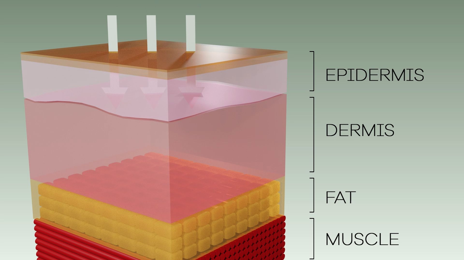
Graphic elements show function, pattern, flow, result, status, relationships, hierarchy, quality, characteristics or attributes, or any added visual emphasis. They can include any object that illustrates the concept.
An example might be if the main shot is of a product such as skin cream to rejuvenate and protect the skin… Well the graphic element might show a nice illustration of the skin and the healing properties of the cream penetrating deep into the skin. You SEE it?
Graphic elements are not necessarily interactive, animated or 3D, but they could be.
What are YOU trying to illustrate?
