
You can Quote Me...
“Communication of ideas is the problem. Graphic design is the solution to the problem of visual communication. As is sound and music to audible communication. Art is the solution to communicating it well.”
—Christian Peritore
What is Graphic Design?
The term "graphic design" means to write or express a concept by "writing" VISUALLY (drawing, painting, etc.), according to a plan, organization or structure of elements in a work of art; composition, diagram, chart, etc., etc., etc.
As opposed to written word spoken word, or other forms of communication, graphics have shape, size, color, etc., that can be SEEN VISUALLY.
Graphic design is a skill and art form where the designer creates visual content to communicate concepts and/or messages (YOUR concept/message in this case).
Graphic Designers use shapes, colors, typography, imagery and photos/pictures, with the use of page layout techniques and visual hierarchy, to convey ideas, concepts and communicate a message. Ideally graphic design should be usable, impactful, meaningful and pleasurable.
What goes Into Good Graphic Design?
So what DOES go into graphic design? Is it just making things look pretty?
When we research and approach a new project, we're asking the important questions:
What audience is the message for? What culture are they? What values and ideals to they hold? What idea, concept or message should be conveyed? What emotion should be conveyed? What imagery should be used? What photos should be used? What subject matter should be used? People? Faces? Objects? Places? What straight lines, curves, angles or criss-crossing lines/objects should be used? What shapes should be used? What patterns should be used? What sizes should be used? What hierarchy should be used? Why do colors have certain meanings associated with them (red=stop, anger or passion; green=go or growth or renewal; blue=trust or stability or purity, etc.) and how should I use them? What color palettes should be used? Primary colors? Secondary colors? Warm colors? Cool colors? Aggressive colors? Receding colors? Monochrome? Analogous? Acromatic? What hues? What tints? What shades? What tones should be used? What color gradients? What opacity? What saturation or intensity should be used? What textures should be used? Bright light? Soft light? Subdued light? Evening light? Candlelight? Colored light? Should things be moved left, right, up or down? Should things be close up, or distant? Should things be in sharp focus or blurred? What opacity should be used? Should some things touch other things, or partially cover other things? What POSITIONING should be used (positioning; something along side something else to create a visual association, or juxtaposition; the fact of two things being seen or placed close together with contrasting effect)? What symmetry and Balance should be used? How to display the flow of things? How much, if any, repetition should be used? The Golden Ratio? The Rule of Thirds? What Fonts and Typography should be used? Etc., etc.
And how to use ALL this to make things VISUALLY usable, impactful, meaningful and pleasurable?
Bad Design is Everywhere
Mistakes or malevolence? Poor education or laziness? Just no artistic talent? Or no quality control?
The inability to observe and SEE the obvious is a blindness indeed.
Hierarchy in Design and Information
I once spent 3 weeks on a project where the client INSISTED on "correcting" the hierarchy of the typography and graphics elements of his entire promo campaign to a point of complete destruction. He wanted certain words and elements bigger, bigger, bigger and bigger, and brighter and brighter, and more red and more yellow, and more bold, etc., etc., to a point where there was zero hierarchy and just one big mess on the page. Chunky minestrone soup spilling all over.
We ended up scrapping everything and starting over because I threatened to walk from the project contract unless he let me do a proper version to look at. Which of course with proper typography and graphic element hierarchy, he liked and kept it.
Lesson learned.
Bad Design Examples
Bad design is a poor use of, or outright violation of the basic principles of good design (outlined herein). Beyond a misspelled word (or a bad haircut in a photo), a casual look around reveals that our lives are surrounded with blunders, errors, faults, goofs, oversights, bungles, flubs, muffed ups, slip-ups, faux pas and truly dumb moves that are too evident to ignore. Bing, Verizon, Pepsi, KFC, Starbucks, AirBNB, Hillary Clinton, and that's just logos, let alone traffic signage, caution lights, and so much more.
Examples are many. Yet we don’t push to rectify them. Why?
Because we aren’t the ones committing those mistakes? Because we're not in charge? Because the companies bearing those offensive graphic design uglinesses are too big to write to someone and let them know how you feel? Because the city and government offices are indeed staffed with minimum wage sloths on depressant drugs?
Perhaps. So why do they matter?
Bad Design Cost Time, Money, Resources, Safety and Well Being
They matter because they’re forcing us to expend more time on a deciphering the message than what should be required.
You doubt that statement? Ok, Let’s find out.
- Ever notice the accidents and long lines of traffic jams start right at the confusing highway signs before a major exit? You curse the traffic jam, but have you ever pondered how it starts? It's not just the bad driver who doesn't drive well.
- Airline Passenger Safety Procedures? Efficient safety procedure? Not if your life depended on it.
- How about the building Fire Escape Plan? The fire is raging out of control, and you find yourself tilting your head reading the escape plan floor layout to figure out which way to run out of the building.
- Parking signs? Shouldn’t parking signs be readable at a glance? Parking signs are not at all designed to be read at a glance. Instead parking signs are more like the fine print at the bottom of an advertisement— they require intense focus, and people get parking tickets all day. It's not just driver neglect.
- How about your airline boarding pass. Have you noticed the poor layout? Most normal users find the essential numbers terribly hard to locate. Sure, attendants will guide you in the right direction, and your problem is solved.
-
Ever tried reading the assembly instructions on IKEA furniture? That's a project.
- Clock has 12 numbers? Dare I hold as an example the simple Clock face that society has used for thousands of years? ...9, 10, 11, 12, 1, 2, 3... Try to teach a young kid how to read a clock face... "the small hand is this, and the big hand is that." There's still many adults that can't read time. The Babylonians divided the day and night each into 12 hours. Living in a mid-latitude and not yet needing the accuracy of a train time table, a twelve hour day was sufficient. They then chose to divide each hour into 60 minutes and each minute into 60 seconds.
I’m sure you’ve experienced the torture of mistakenly misunderstanding so many graphic design blunders in our world, and those few seconds of severe frustration till you realize the mistake! You quickly realize your mistake, correct it, lesson learned and move on with your life. But at the very least you're left disgruntled, for sure.
Your Customers and Clients / Your Revenue
Now the above examples may not have been as obvious at the time, but imagine YOUR clients and customers and new prospects trying to decipher your promo for the the answers they seek.
What is it? What does it do? How much it is? How do I get it?
They struggle. They get frustrated. They give up. They move on... to your COMPETITION!
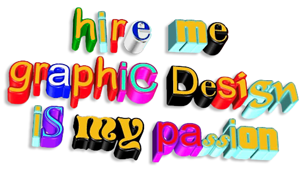
Why not hire a good graphic designer?
Perhaps we're being too dramatic? But let me ask you this; If mistakes are to be learned from, why not hire a good graphic designer?
Bad design is all around us and in fact, more visible than good design. As human beings, when we are exposed to good design, very rarely do we stop to absorb the full weight of it. That is because good design is so seamless, so invisible that its presence is only felt, not realized.
Bad design, on the other hand, is screaming at you, demanding to be noticed, costing you time, customers and revenue.
If you have to search and hunt for details on how to use a simple product, know that its GRAPHIC DESIGN materials have failed in their function and purpose to VISUALLY EXPLAIN the instructions. The message. Any concept.
As a business person, it is vital to recognize and prevent your promo and materials from bad design. Because how else will you build a better future for your business if you don’t first remedy the present bad graphic design?
And I promise you, once you’ve had a taste of good design, you’re never tempted to go back to bad design just to save money.